We accompanied
TAFF!
Building a brand designed for urgency and field proximity
TAFF! was born from a simple observation: in emergency situations, subcontracting must be fast, reliable, and human. Companies need an immediate relay, capable of acting quickly, locally, and in full compliance with regulatory constraints.
TAFF! positions itself as a trusted third party. A hands-on player, able to mobilize the right resources, in the right place, at the right time, across all sectors of activity.
The challenge was therefore clear: create a strong, recognizable, and reassuring identity, capable of supporting TAFF!'s development across multiple sectors of activity.
A brand to establish, a vision to project
Before our intervention, TAFF! needed to address several challenges:
- Create a credible and differentiating visual identity
- Visually convey the notion of urgency without being anxiety-inducing
- Highlight field proximity and the human dimension
- Design an image capable of evolving with the project's multi-sector expansion
- Lay solid foundations for future communication materials
Key objective: build an identifiable, professional, and scalable brand, aligned with TAFF!'s promise.
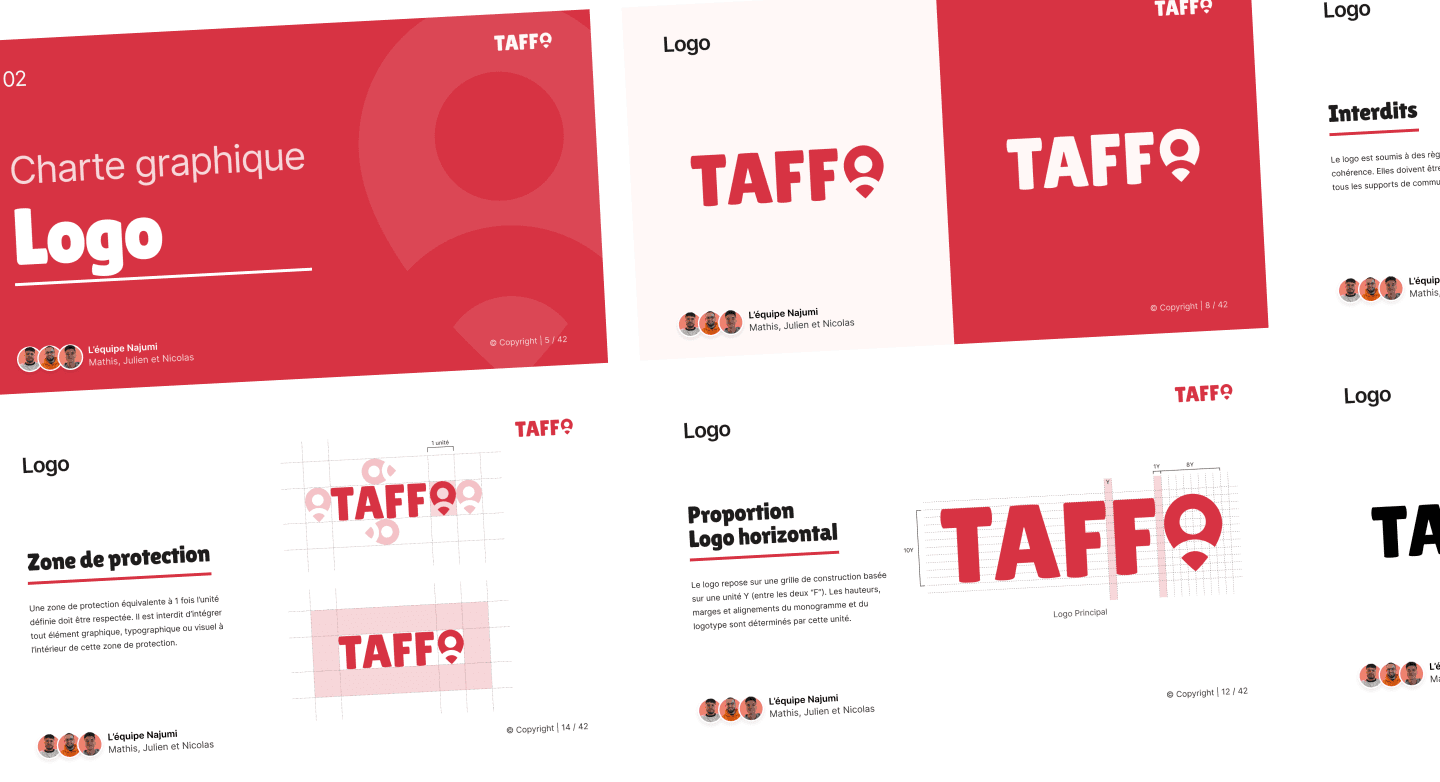
Designing a strong and lasting visual identity
Our support was structured around several complementary pillars:
- Creation of the TAFF! logo and its graphic system
- Definition of visual codes (colors, typography, iconography)
- Work on brand meaning and readability
- Building an identity designed for all media (print, web, signage, application)
- Delivery of a ready-to-use brand guidelines document
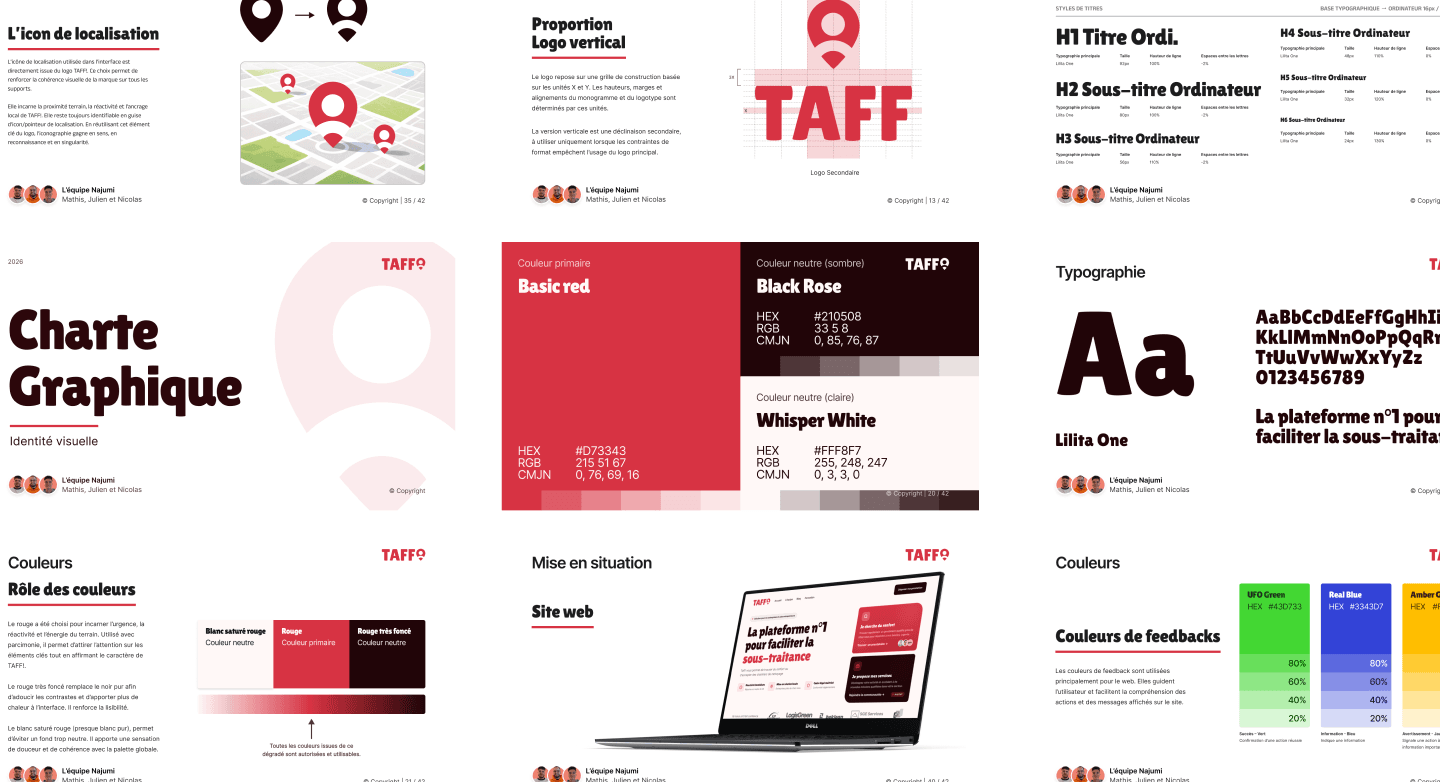
Our methodology: Giving meaning before building

Scoping & vision
Definition of emotions to convey (trust, responsiveness, serenity)
Consideration of the long-term vision and sector expansion

Art direction
Integration of the location marker to symbolize proximity
Work on the symbol to strengthen brand identification (human-oriented)

Graphic system
Color palette centered around red and adaptable
Expressive typography to assert TAFF!'s personality
Iconography defined in line with the brand
Logo mockups (email signature, website hero, t-shirt, mug...)
A new memorable brand image
- Strong and identifiable logo
- Modular symbol, usable as a location icon
- Consistent color palette usable across all media
- Brand guidelines designed for daily use
- Solid visual foundation to support TAFF!'s future growth
Tools and technologies used
What we delivered
Logo Presentation Materials
Brand guidelines
Logo exports (PNG, SVG, PDF)
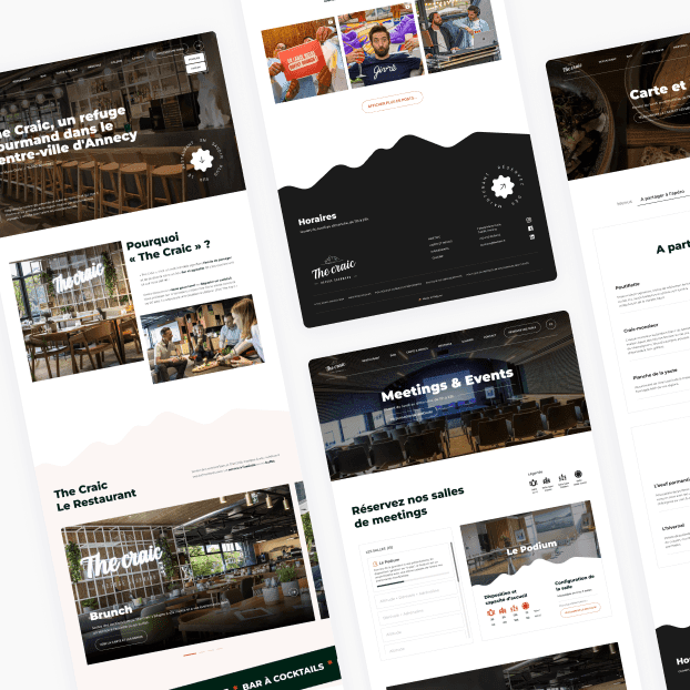
The Craic
Grow your business now
Ready to turn your idea into reality? Tell us about your project and receive a personalized estimate.
Response within 24h - no commitment
